

Datto
—
Project: Datto – Brand Refresh
Role: Creative Direction, UI/UX, Illustration
Agency: Datto
Program: Datto Homepage refresh – Creative Direction, UI/UX, Illustrations, Blog Illustrations
Program: Backupify – Sub-Brand – UI/UX, Illustration
Program: Wifi – Sub-Brand – UI/UX, Illustration
Program: DattoCon – UI/UX
Program: Datto Cloud – UI/UX
I was brought on board by Mindtrust to lead a website refresh for Datto. What began as a digital redesign evolved into a year-long brand transformation, with my work in UI/UX, illustration, and creative direction helping shape a new visual identity that eventually extended beyond the website and influenced Datto’s broader print brand guidelines.
The refreshed digital experience featured custom three-quarter-view illustrations, character artwork, original iconography, and technical diagrams, giving developers and partners a deeper understanding of what made Datto unique. The goal was to create a more engaging, visually cohesive brand experience that communicated the company’s personality and technology.
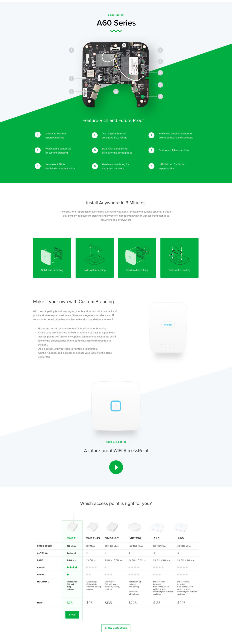
From there, my role expanded to include Datto’s sub-brands. Backupify received a new identity that maintained a visual connection to the parent brand, while OpenMesh took a more distinct creative direction, establishing its own personality and digital presence.
What began as a website redesign ultimately became a five-year creative partnership, spanning brand development, digital experiences, illustration, and animation. It was an incredibly rewarding chapter, filled with great people, creative challenges, and some of my favorite design work. The partnership eventually came full circle with Datto’s acquisition by Kaseya.
DATTO.COM
The Datto project centered on a comprehensive brand refresh, where I led the UI/UX design and illustration for the homepage and secondary pages before transitioning the work to junior designers for continued development.
I established the refreshed visual language, including a new icon system, typography, and variable-width text treatments. I also created the custom hero illustrations, three-quarter-view technology illustrations, and supporting body artwork. Where appropriate, I delegated illustration production to junior designers, providing art direction and visual standards to ensure consistency with the established three-quarter-view illustration style.
My focus was on creating a cohesive digital experience that brought the refreshed brand to life through thoughtful interface design, custom illustration, and a consistent visual language.


BACKUPIFY
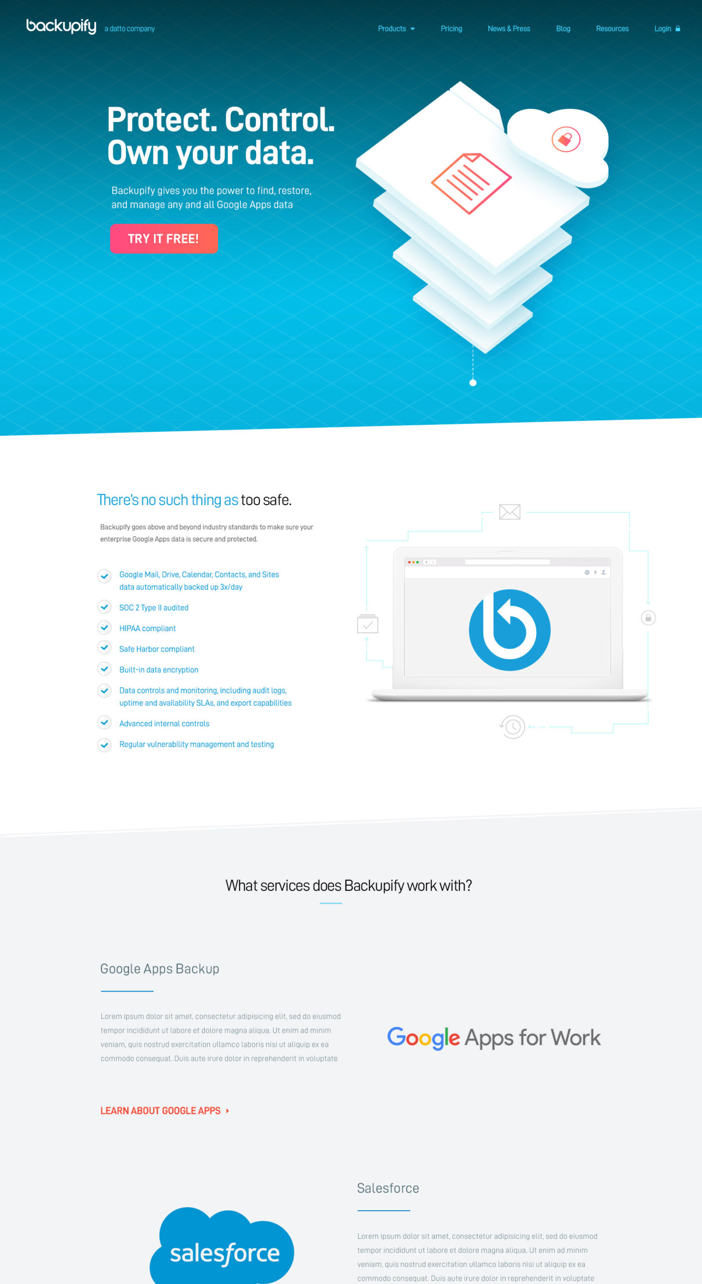
Backupify was a brand refresh of an established Datto brand, designed to position the platform as a comprehensive cloud-to-cloud data protection and security solution. While Backupify integrates with Datto’s core product offerings, it also delivers a standalone cloud-to-cloud backup platform.
The primary creative challenge was to communicate the value of its time-based, rolling backup architecture to a technical audience, particularly developers. The messaging focused on demonstrating how cloud-powered automation reduces risk, minimizes costs, and simplifies data protection, ultimately making backup management more efficient and accessible.


DATTO CLOUD SHOWCASE
OPENMESH


“Bringing Todd on board was a game-changer for Datto and helped elevate the brand to the next level. His digital design work ultimately became the foundation of Datto’s overall visual identity, with its illustrations, iconography, and layouts shaping the brand’s broader image. Todd led the creative direction, illustration, and video storyboarding throughout the entire initiative.”
— Chris Eratto, Mindtrust Agency